Dodoo for Timon

Hi Timon, I’m Dodoo.I’d love to work at Timon as a product designer

“…I admire her ability to poke at and challenge proposed solutions to arrive at the right one.”
— Adedeji Olowe, Founder, Lendsqr

So here’s what you’d want to know about me

I’ve got over 5 years of product design experience across FinTech, SaaS, AI, Procurement, Enterprise tooling, etc. I’m a writer and a thinker, and these come in handy when I design products. My strong suit? UX research. But I cook up a mean interface when I need to.

Now, to weightier matters…

I redesigned Timon’s card creation flow and here’s why.

It started with me trying to get a card

Happened early October 2026

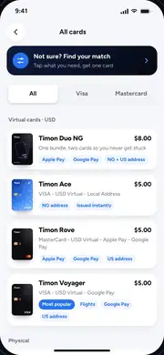
I deleted my old virtual card on the Timon app and wanted to create a new one. That process took way too long. There were too many options and too many decisions, and too much figuring out to do.

So I tapped “Need help deciding? Speak with Temi”. It took me out of the flow and into a support chat, where I explained what I needed. I got back a long answer naming two cards, then had to go back and find the right one myself.

  1. Global or Domestic?
  2. Physical or Virtual?
  3. Mastercard or Visa?
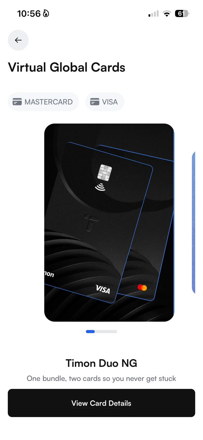
  4. Swipe four cards, one at a time
  5. Ask for help
  6. Explain my needs
  7. Choose between two cards
  8. Return and search for the card

Steps 5 to 7 happened in a support chat, outside the card flow.
Turns out this was causing a bigger issue

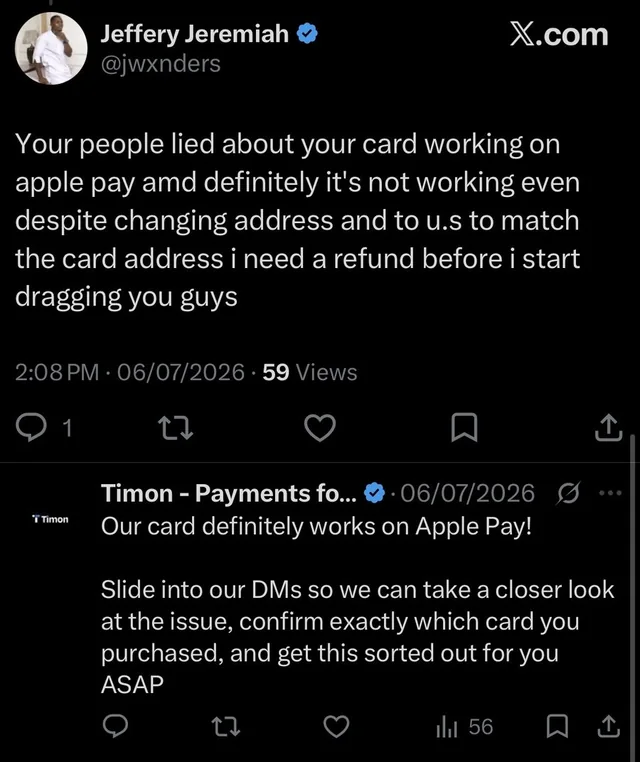
I went looking to see if others had the same experience as me. On X (Twitter) and in Timon’s App Store reviews, customers were running into issues that shared a solution with my issue. They were using the wrong cards because it wasn’t clear what each card did. They only found out when the card didn’t work where they needed it.

  • Post on X: the card doesn’t work on Apple Pay, even after changing the address to the US. Timon asks which card was purchased.
    on X
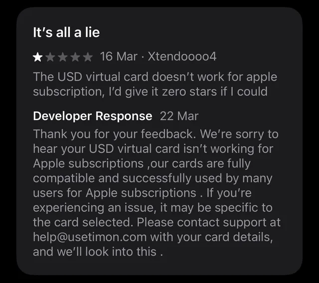
  • One-star review: the USD virtual card doesn’t work for Apple subscriptions. Timon’s reply says the issue may be specific to the card selected.
    App Store review
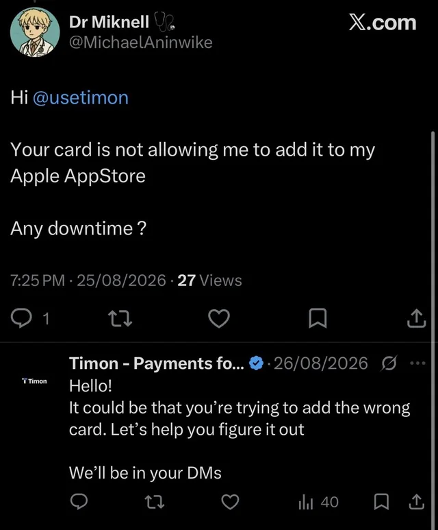
  • Post on X: the card won’t add to the Apple App Store. Timon replies that the customer could be trying to add the wrong card.
    on X
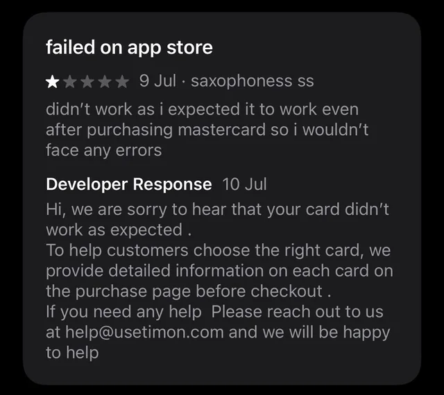
  • One-star review: the card didn’t work on the App Store even after buying a Mastercard. Timon’s reply points to the card details on the purchase page.
    App Store review
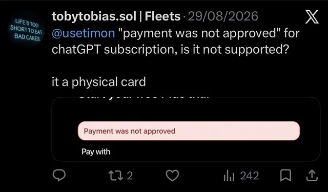
  • Post on X: “payment was not approved” for a ChatGPT subscription on a physical card.
    on X
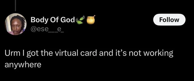
  • Post on X: the virtual card isn’t working anywhere.
    on X
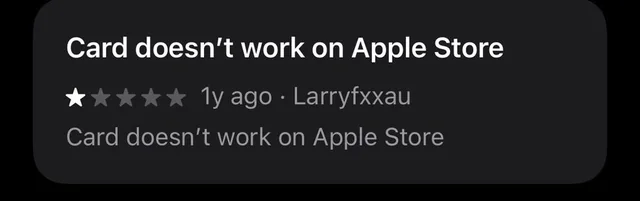
  • One-star review: card doesn’t work on Apple Store.
    App Store review

So here’s the real problem

When customers create a Timon card for a specific payment need, they may struggle to identify which card variant supports their intended use case because the available options and their differences are not sufficiently clear to them at the point of selection.

This creates additional decision effort and reliance on support, potentially leading to card creation abandonment, unsuitable card choices, unsuccessful payments, and reduced customer trust.

Here’s my proposed solution

Show users clearly what each card does without depending solely on text. By including other visual elements, users can immediately see what a card can and cannot do, thus reducing the friction in card creation, and the “not working” complaints.

Displaying card capabilities

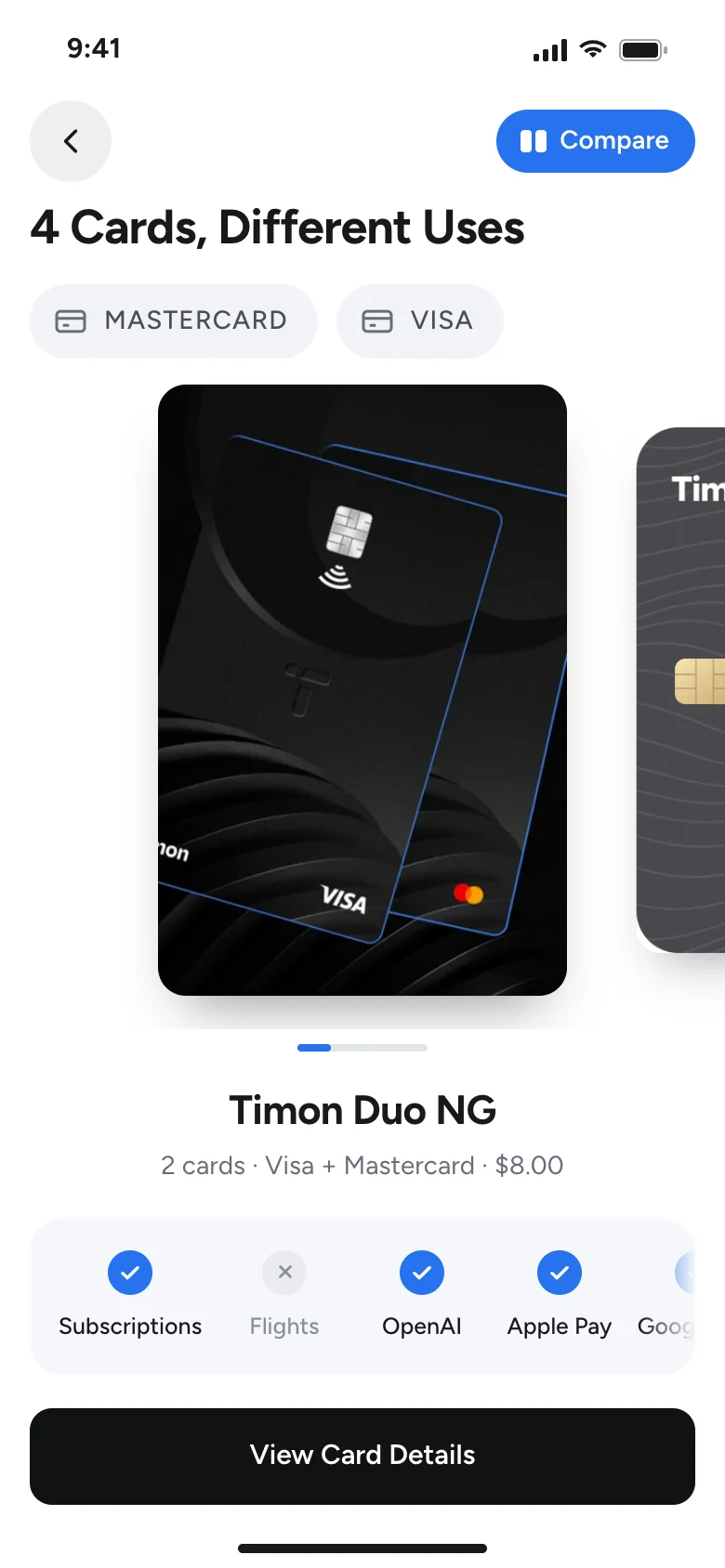
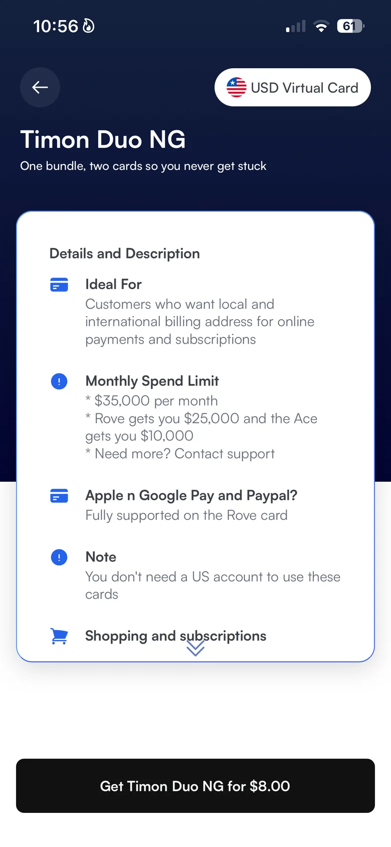
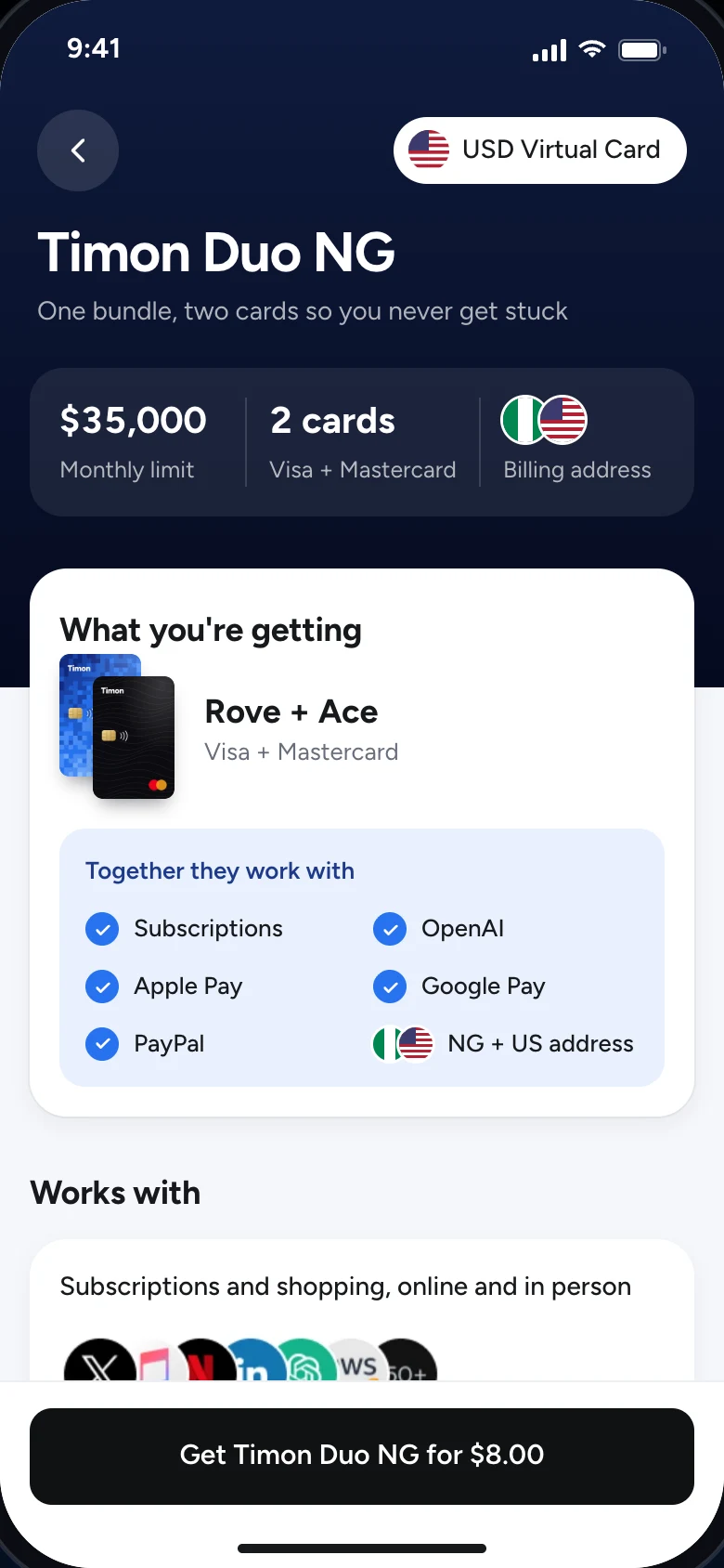
I introduced a row underneath the card to visually describe where the card works or doesn’t work.

Before
Timon today: Displaying card capabilities
After
Proposed: Displaying card capabilities

Visual elements over text

Users may avoid reading a whole lot of text. By introducing visual elements to break up the text, the user becomes more likely to read.

Before
Timon today: Visual elements over text
After
Proposed: Visual elements over text

Comparing cards

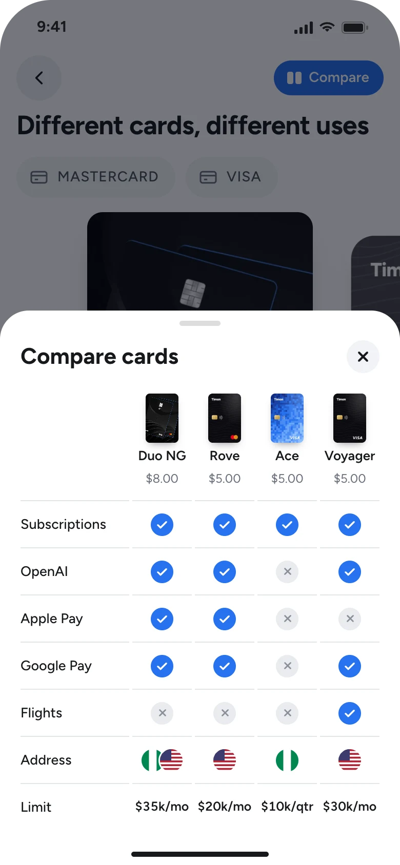
Swiping through cards forces the user to rely on their memory/recall. By displaying all the cards at once, the user is able to make a decision faster, and more accurately.

Before
Ooops!Nothing to see here....yet
After
Proposed: Comparing cards

You can try it out yourself

Designed in Figma, Prototyped in Claude Code.

I had to make
some tradeoffs though…

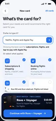
I came up with multiple solutions, but canceled them out for one reason or the other. The solution below made it all the way to the prototype stage before getting discarded. I explain why below.

  • Discarded: User describes what they need a card for or selects from the options provided and we recommend the right card(s) to them.

    A recommendation engine of this sort would require time and resources that the team may not have right now. It may also come with some liability if not well managed.

  • Discarded: A dedicated screen to see all cards and their key features at a glance.

    I decided we did not need a whole screen for this. A table comparing the cards in a bottom sheet works just fine. For now.

What success would look like

If customers can see what each card does before they pick it, here’s what I’d expect to be different.

    But hey, all of this is looking from the outside in.

    I don’t presume to know better than your designer. There may be data that points somewhere else, and constraints I can’t see from here. This redesign is my best reading of the problem as a customer. With Timon’s data and a clear picture of its constraints, the flow would be tailored far more closely to Timon and its customers.

    Worth mentioning...I’ve designed money products before

    My most relevant work is at Gomoney, where I designed cards, investing and overall transaction experience. Since then, I’ve led design on AI products for business and government.

    Gomoney

    UX Designer & StrategistContract · Apr 2023 – Jan 2026

    Gomoney is a digital bank for young Nigerians and during my time there, I redesigned the cards feature, onboarding, bill payment, and designed two new features. Designing the admin must’ve been my favourite task there.

    $100Kprojected revenue in six months from two new features
    80%fewer customers dropping off during onboarding
    35%higher customer satisfaction per user feedback
    75%more user research used in product decisions

    GoGlobal

    Dollar (and Naira) cards inside Gomoney

    Following the lift of the CBN ban on fx payments, I redesigned the cards feature, smoothening out the experience and creating provision for new introductions to cards.

    Projected $2.0m in transaction volume

    Go[redacted]

    A new feature yet to go live

    I worked closely with the Product Manager to understand the PRD and business case, conducted independent research by speaking to the target market, then taking the feature from idea to approved prototype from stakeholders.

    Projected $100k revenue in 6 months

    Onboarding

    More people finish signing up

    I overhauled onboarding so new customers reach a working account instead of quitting halfway. We were also bringing in customers from a separate source that may or may not already have wallets with us. I designed the onboarding to accommodate this.

    80% less drop-off

    Also

    1. Mobile app redesignLendsqr · Contract

      I worked on a mobile app redesign to improve the in app experience and simplify the onboarding process

    2. UX Strategist & Lead Designer, AIOffice of the Head of Civil Service · Contract

      Designed a performance management system for about 720,000 federal employees and supervised the design team.

    3. UX Strategist & Lead Designer, AIMultonion · Full-time

      Led UX strategy for AI search across 10,000+ data points. Search time dropped 60% and workflows improved by over 30%.

    And this is the plan for my first week at Timon

    1. Monday

      Understand what’s being built

      I’d meet the team, study relevant documents, and look at the roadmap of where we are headed.

    2. Tuesday

      Sit with customer support

      Read tickets and reviews to find the problems that cost Timon most.

    3. Wednesday

      Use the app as a new customer

      Sign up from scratch and note where people get stuck.

    4. Thursday

      Design solutions to small problems

      Build a working prototype of the fixes I intend to propose and confirm that there are no constraints to their implementation.

    5. Friday

      Share these small fixes

      Walk the team through my findings, fixes, and documented solutions to larger problems

    Oh and one last thing

    A captcha box reading “I’m not a robot”, with a Submit button.
    • Dodoo paddling a kayak through tall reeds
      kayaking
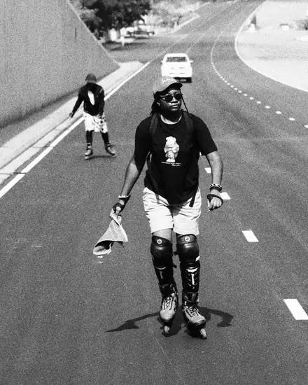
    • Dodoo inline skating down an empty road
      skating
    • Dodoo smiling in a cap and sunglasses
      smirking?
    • Dodoo sitting under a waterfall as it splashes over her
      channeling...sumn
    • Dodoo skating, photographed from above
      skating some more
    • Close-up of Dodoo smiling through her locs
      flaunting my locs

    So Hire me as a product designer on the Timon team.

    I’d be happy to jump on a call at your earliest convenience so we can discuss this further. I know I’ll be a great addition to the team. You’ll see.

    stephorkuma@gmail.com
    LinkedIn